The New York Academy of Art is pleased to share a new note by Hilary Harkness. Regularly posting her “Notes from Studio Lockdown,” Hilary blogs with us as she prepares for her upcoming exhibition in May at Mary Boone Gallery in New York City. Follow her on this blog for sneak peeks into her studio practice!
Dear friends,
Recently I was asked for some tips on creating the illusion of space in a painting. I like this question, because as mysterious as the painting process may seem to be, most of what I do as an artist is very basic. Even as I am finishing a painting, my process is still all about the fundamentals. Here are five simple ways to create space in your painting – but please do chime in if there are more you can think of.
1. Overlapping
We all know this one – paint a person in front of a tree and the tree recedes. But here, Degas gets extra-tricky by slightly blurring, fading, or obscuring some of the background objects the moment before they dip behind the central figure.
 |
| Degas |
2. Dark vs. Light
Notice how in this painting by Josef Albers the black square seems to automatically recede. The lighter colors pop forward, and as I see it the constructed space flickers inwards and outwards. I challenge you to see this space as flat!
 |
| Albers |
3. Atmospheric Perspective
It is easy to find Renaissance paintings that have colors that fade out to blue in the distance, however, you can use any color yourself for this purpose if you lower the contrast as you push objects further back into space. Here’s a favorite of mine by Gerard David.
 |
| Gerard David |
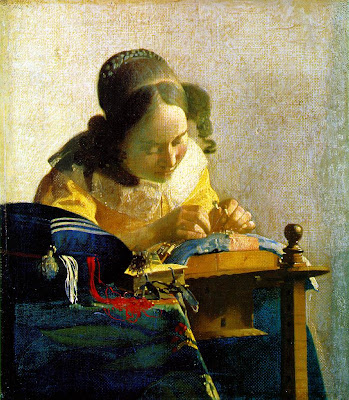
4. Focus
Photographers use it, painters use it, and I sure wish more sculptors would use it! Here we have Vermeer’s Lacemaker – note how the objects on the front table seem miles closer to us than the girl’s head. When I look at this painting, I feel like I am microscopically tiny, looking toward a distant mountain that happens to be a girl.
 |
| Vermeer |
5. One and Two-point Perspective
All I can say is hit the books. Here is a website on this subject that is fascinating and T.M.I.
 |
| Canaletto |
An advanced perspectival technique is to determine how far the viewer’s eye is from your painting, and to then calculate how quickly things recede into space. Here’s a subtle case in which the artist William Bailey uses a very quick speed of spacial recession to make the viewer feel pushed far away from the picture plane. Our eyes are tricked into thinking these objects are on a narrow shelf, but we also know that each of these overlapping jars must be several inches in diameter. If our ‘eye’ was close to this still-life, the top lines and the bottom lines of the vases would not both be so straight and parallel to each other. This is indeed a painting of a still life as viewed from across a room, and that is why the space seems so shallow and flattened in some ways.
 |
| Bailey |
Yours very truly,
Hilary Harkness
