Cornscapes
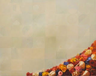 |
| Ode to Nebraska, oil on canvas, 48x60in. |
by Emily Adams (MFA 2011)
It’s the end of the semester and we’re seeing our MFA Thesis projects through to completion. To close up the posts on my thesis process throughout second year here at the Academy, I thought I’d share several of my most recent paintings, along with some interesting work that has been brought to my attention over the course of the past couple months. Exploring American farmland, aerial view, has been like picking up a rock to discover a whole other world underneath. With one of the simplest of subjects—the grid—I’ve found all kinds of problems to try to solve over the months. A straight grid speaks to an entirely different history of painting than one shifted into perspective, color and atmosphere follow different sets of rules when investigated from 30,000 feet in the air, and the surface of the painting itself has become a more significant subject when the image is so pared down. Most importantly to me, the grid as farmland, too, lends additional elements of narrative and symbolic suggestion that only representational painting can bring. Who would have thought soybeans and corn could offer so many aesthetic possibilities?
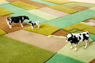 |
| Carpet design by Florian Pucher |
In the past couple of months, friends have sent along various sightings of crops popping up in several corners of art and design worlds. I wasn’t really looking to be in dialogue with a carpet designer, but this just confirms my suspicion that the grid is slowly making its way into our visual culture as a new, dominating form of landscape.
Also, if anyone can help me, I am still trying to track down the artist who made this piece spotted hanging at a gallery on 23rd St.
 |
| William Steiger’s Aerial Survey #2 at Margaret Thatcher Projects [Identified- Thanks to John Jacobsmeyer] |
As I look forward to developing my own work after graduation, I’ll be thinking a lot more about the concept of ‘cultivation’ particularly in the context of the early American botanical and cultural history that I am related to. Culture, the word itself, has its Latin roots in tilling and agriculture, so exploring the ‘cultivation’ of a society in a new landscape by juxtaposing variations in the traditions of landscape and flower painting (considering flowers moved with people across seas to be hybridized and seeded in so-called ‘virgin’ soil) seems to me a good place to dig for now. Here are a couple of interesting grandparents of the melded genres:
Eric Telfort: Keeping the Brushes Wet, part 3
The New York Academy of Art is pleased to present the next installment in this new series on our blog. Eric Telfort, a 2009 graduate of the New York Academy of Art, blogs with us about “keeping the brushes wet.†Eric will be speaking at the Academy as part of the Career Development Workshops on April 21, 1-2pm. Current Students and Alumni welcome to attend! Follow us as Eric writes about what it’s like to be a working artist.
Continued from the last post:
As an AmeriCorps supervisor, I tend to the children of a small community in Providence, RI. I eat trail mix and delicately prepared buffalo chicken sandwiches for lunch. I arrive home at 6:30pm and am tranquilized by the msg dinner that I often prepare. I wake up at 3am and the system starts all over again. As grim as this may sound there is hope. I am coming to grips in understanding that art is the liquid that makes my heart pump. As much as I love the kids I work with, not being able to paint makes me feel nothing. Wine has no taste without the art to accompany it. I have made serious sacrifices in the last month to win the custody battle of my art from my other life; the one that pays my bills. Gone are facebook, and the romances of 2010. They shall be missed, especially the ladies. My only romance at this point is the brush and the canvas, and on occasion the sculptor’s clay and Breyers vanilla ice cream. I am working on continuing the series I began during my 2nd year at the Academy. I like to make paintings reinterpreting my artistic childhood as an adult. What I find many times is so much of society’s issues were present in my own childhood and now reside in my paintings. I was too naïve then to pay attention to them and rightfully so. I was 6, and being 6 is not easy when you have a backyard full of junk to battle invisible aliens with. Even as an adult, I am not able to see these common threads until the piece is near completion. It is now 6:30am and the shower calls. For the first time, the thoughts that go through my mind between 3am now have found their way onto digital format – this blog. Either way, going forward the message I hear in my mind every morning is “the brushes can not dry.†Time for work.
To be continued…
Tribeca Film Festival at the Academy

Show us YOUR Studio – MFA OPEN STUDIOS 2011
The New York Academy of Art is pleased to invite you to our annual MFA Open Studio event on Friday, April 29th from 5-9pm. On the heels of Tribeca Ball 2011, five floors and over seventy studios will be open to the public and will present an amazing array of artwork.
We’re so excited about our third annual Open Studios at the Academy that we want to share some studio love with everyone!
Show us YOUR Studio for a chance to win a free Academy t-shirt. Any and every studio will do! Email charis@nyaa.edu a picture of your studio, or upload a photo and tag it to the New York Academy of Art’s wall on facebook.
Your studio shot will be entered in a raffle to win a free Academy t-shirt. We’ll collect the photos in an album on facebook (tag yourself, too!) and then we’ll email the winner and announce it during Open Studios on April 29th!
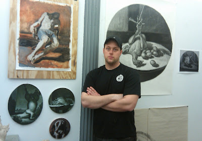
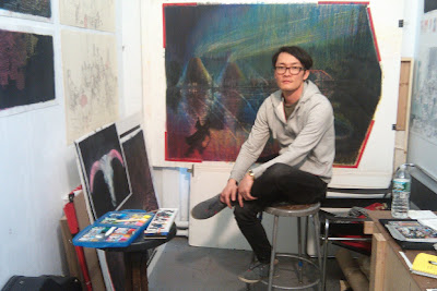
Studio Shots: Cori Beardsley, Ramona Bradley, Nadene Grey Speer
Eric Telfort: Keeping the Brushes Wet, part 2
The New York Academy of Art is pleased to present the next installment in this new series on our blog. Eric Telfort, a 2009 graduate of the New York Academy of Art, blogs with us about “keeping the brushes wet.†Eric will be speaking at the Academy as part of the Career Development Workshops on April 21, 1-2pm. Current Students and Alumni welcome to attend! Follow us as Eric writes about what it’s like to be a working artist.
Continued from the last post:
I imagine myself painting and discovering new paths and hidden alleys to “the piece†– the piece we all are chasing as artist. This piece is the piece that tells the world that you have it and have nothing left to offer. I feel as an artist I will always be chasing the truth on a 2-D plane. Like Juan De Pareja before me my dream is to create a truth that is unequivocal. I wake up at 3am paralyzed in bed thinking of the day ahead of me. I peer to my left and see a painting demo from the academy completed a year ago. I observe the subtle shifts of value, and the blind confidence in the brush work. I turn to my right and I see papers. Lots of paper. Loads of paper. Paper that has nothing to do with shifting tone, or creating the illusion of a lily pad floating on water that one does when painting a highlight on the eye.
I blink and the sun addresses me with a cold hello telling me I have to be at work in an hours’ time. Life beyond the Academy is not the fantastical world one imagined it would be after graduating. I mean, in looking back the Academy reminds me of Bouguereau’s Nymphs and Satyr painting. There were amazingly beautiful women everywhere, and I was floating in a sea of artistic enchantment, and, without the pressure to work for money, and given the opportunity to keep my brushes wet. Wet with paint, not turpenoid as they have been for the last couple of months and counting. Gone are the days of being able to spend a day on an idea or carefully studying a head. Time is money now a days and I have neither. I wake up and proceed to my job as an AmeriCorps supervisor.
To be continued…
Studio Shots: Ian Healy, Guno Park and Elena Rodz
“I try to find ways to express pain and anguish in multiple depictions, primarily through animal forms, as people react differently to animals then humans. I try to see what can really evoke feelings of pain and emotion in people. In my work that incorporates human forms, I find the themes tend to be more personal.”
“My paintings are depictions of pure id creatures – running around the forest getting eaten by animals and making love in the moonlight.”
Eric Telfort: Keeping the Brushes Wet
The New York Academy of Art is pleased to present a new series on our blog. Eric Telfort, a 2009 graduate of the New York Academy of Art, blogs with us about “keeping the brushes wet.†Eric is currently located in Rhode Island, but was able to experience a residency in Zimbabwe during the summer of 2010. Follow us as Eric writes about what it’s like to be a “working artist.â€
Wiggle the big toe. I spent a greater part of my winter vacation sidelined by a turf toe injury that left me ever so helpless. Was it an excuse to not paint? One would answer no. However for me it was different. Being able to dance after finding an unequivocal stroke that cannot be interrupted by another on a canvas is what makes the experience that more exciting. While many find the pleasure in finishing a piece, I find pleasure in the simple contact of a wet brush onto the surface of an unfinished piece. I can recall many a time where painting left me violently sexual wanting to create the most unimaginable pleasures to my ex-girlfriend. In those moments I had to walk away from the work and retreat to Call of Duty on my Playstation 3 to calm me down a bit. Finishing or completing the piece leaves me tired for the most part. There’s an overwhelming feeling of relief and hope when the toe decides to cooperate with my neural senses and inches towards me. I’m gaining my life back… well, sort of. It has been 6 months since I came back from Africa and I have yet to infect a canvas with my artistic thoughts. I have a job. A 9am to 6pm job that drains my energy slowly throughout the day and throughout the day all I think about is art.
To be continued…
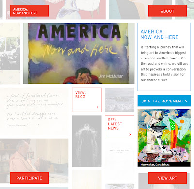
Eric Fischl – AMERICA: NOW AND HERE
The Academy is honored and thrilled to share the news about Senior Critic Eric Fischl’s exciting exhibition:
From AmericaNowAndHere.org:
“America: Now and Here
began when the artist Eric Fischl invited a group of friends and peers, all leading visual artists, musicians, poets, playwrights, and filmmakers, to submit a work of art reflecting their points of view and hopes for America.
Fischl established a not-for-profit to share America: Now and Here with communities across the country through programs, media and a traveling multi-disciplinary exhibition and event.
America: Now and Here is positioned to launch a national dialogue about America through art, to spark local activities and fuel imaginations, and generate innovation from coast to coast.
Through this national creative experience America: Now and Here positions art as a catalyst for bringing people together to discuss important issues and big ideas relevant to what we hold dear: America.
This movement offers an unprecedented opportunity to the American public to engage with art, poetry, film, plays and music by more than 150 of our country’s celebrated artists.
Promoting creativity and innovation as the foundation of our society, America: Now and Here will invite participation through a cross-country tour, website and social media, public programs and youth engagement, publications and Artist Response.”
Find out more from The New York Times.
Studio Shots: Aleah Chapin, Holly Ann Sailors and Richie Fine

my artwork is beautifully haunted. By using vintage photography I am evoking memories of the past and creating a conversation with the present viewer.”
