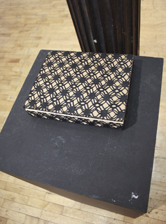
ALUMNI SPOTLIGHT: Brian Fencl
The Academy is pleased to share a new ALUMNI SPOTLIGHT series on our blog. We’ll be spotlighting our alums to give you an idea about what it’s like to be an Academy grad, starting with Brian Fencl, MFA 2000.
What are you currently working on?
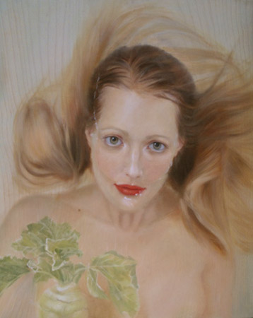
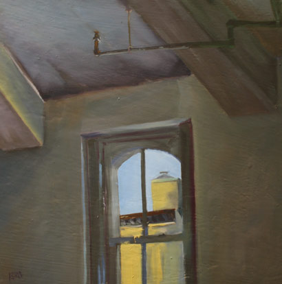
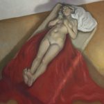
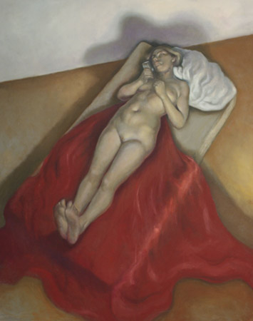
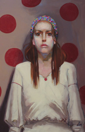
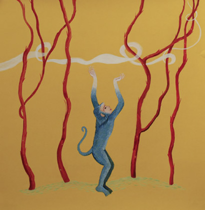
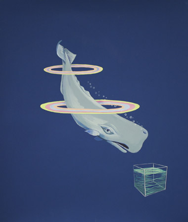
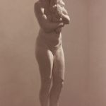
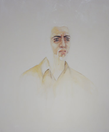
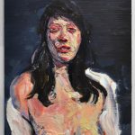
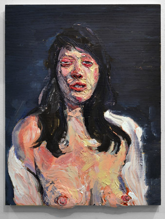
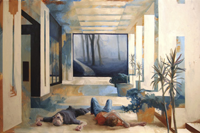
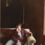
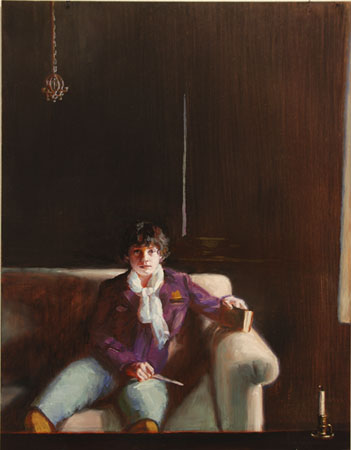
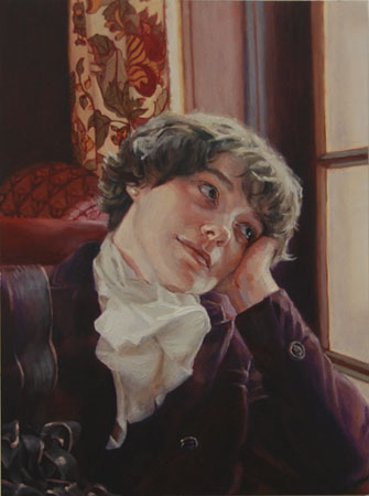
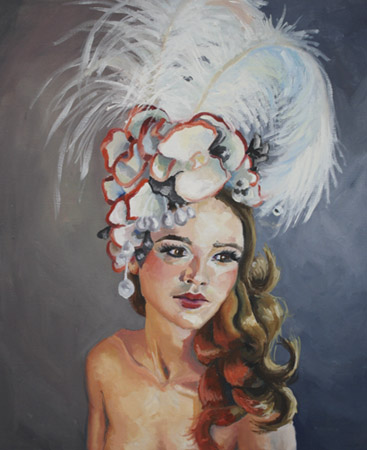
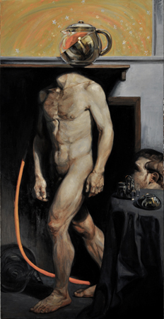
 |
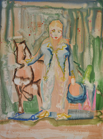
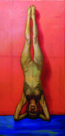
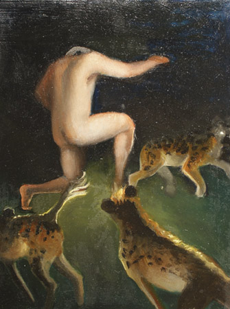
| Brian Fencl, “Oh, Thank Heaven” oil on canvas, 24×18 in. |
At the moment I live in two worlds. I am in the professor/ administrator world and the world of my studio. Both are satisfying worlds to be in and most of my answers will reflect this reality. In the studio I am in the beginning stages of creating work for the 2012 West Liberty University faculty show. We show every year and the theme for the next show is “meat.” In my faculty/ administrative duties I am working on expanding our programs and creating a downtown arts center in the city of Wheeling, WV. The center has the possibility of revitalizing the downtown area and solidifying the Universities place as the cultural leader in the Ohio Valley. It is a big idea and I am thrilled that I get the opportunity to help make it a reality.
What was your most recent big thing?
I had a solo show at West Virginia State University in Charleston, WV last November. I also really enjoyed the the alumni show and gathering last fall at the Academy. That was a revitalizing experience.
What do you find challenging about your work?
In the studio it is remaining consistent. In New York and at the Academy it is easy to get valuable feedback about the the work while it is in process. I don’t have that luxury here in West Virginia.
What do you find rewarding?
My job is basically to show people how to make art, talk about art history, and make art myself. That is what I do all day and I do it with people that are enthusiastic and eager to learn and grow. I am also now in position as a Department Chair to expand the role of the arts at the University and in the community I live in. From 2008 to 2010 I was the Visual Arts master teacher for the West Virginia Governor’s School for the Arts. The WV GSA works with students entering their junior year of high school. They spend three weeks with us immersed in the arts.
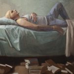
 |
| Brian, in the studios at West Liberty |
Last summer I was able to bring John Wellington (NYAA ’90) out to work with the GSA students. He really connected with the kids, dramatically improved their skills and was a great ambassador for the Academy. It’s pretty cool that I have the ability to guide young artists and work with great people like John.
What’s on the horizon for you?
2011 marks the 6th annual Paint Ogelbay: Plein Air weekend. It is an event I founded and have been organizing with a couple of local arts organizations. Last year we had fifty artists participate and we are hoping to be able to grow the event. West Virginia is a beautiful place and in the near future I would like to organize with the Academy an opportunity for students and alumni to come to West Virginia and do some plein air work.
I also want to give a shout out to the West Liberty University Art site. I am always looking to get the word out about what a great place it is and hopefully find new supporters, artists for the gallery and workshop proposals.
Brian Fencl
Interim Chair Department of Journalism, Communication Studies & Visual Arts
Associate Professor of Art, West Liberty University
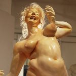
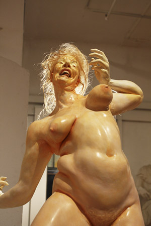
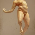
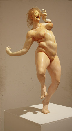
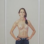
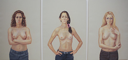
Commencement 2011 with Jenny Saville
MFA Thesis Exhibition 2011
-
- Carrie Adams (MFA 2011)
-
- Emily Davis Adams (MFA 2011)
-
- Kiley Amesklein (MFA 2011)
-
- Kiley Amesklein (MFA 2011)

-
- Elina Anatole (MFA 2011)
-
- Elina Anatole (MFA 2011)
-
- Christina Barber (MFA 2011)
-
- Christina Barber (MFA 2011)
-
- Christina Barber (MFA 2011)

-
- Christina Barber (MFA 2011)
-
- Corinne Beardsley (MFA 2011)
-
- Corinne Beardsley (MFA 2011)
-
- Corinne Beardsley (MFA 2011)
-
- Demetrio Belenky (MFA 2011)
-

- Brian Burke (MFA 2011)
-
- Brian Burke (MFA 2011)
-
- Brian Burke (MFA 2011)

-
- Brian Burke (MFA 2011)

-
- Susan Calace Willow (MFA 2011)
-
- Yi Cao (MFA 2011)
-
- Yi Cao (MFA 2011)
-
- Yi Cao (MFA 2011)
-
- Diana Corvelle (MFA 2011)

-
- Cara De Angelis (MFA 2011)

-

- Cara De Angelis (MFA 2011)

-
- Daniel Esquivia-Zapata (MFA 2011)
-
- Daniel Esquivia-Zapata (MFA 2011)
-
- Charlotte Foyle (MFA 2011)
-
- Jeff Gipe (MFA 2011)
-
- Jeff Gipe (MFA 2011)
-
- Jeff Gipe (MFA 2011)
-
- Jeff Gipe (MFA 2011)
-
- Jeff Gipe (MFA 2011)
-
- Jeff Gipe (MFA 2011)
-
- Jason Green (MFA 2011)

-
- Amber Hany (MFA 2011)

-
- Amber Hany (MFA 2011)
-
- Amber Hany (MFA 2011)

-
- Amber Hany (MFA 2011)
-
- Melissa Hardison (MFA 2011)
-
- Mary Harju (MFA 2011)
-
- Brett F. Harvey (MFA 2011)
-
- Brett F. Harvey (MFA 2011)
-
- Brett F. Harvey (MFA 2011)
-
- Ian Healy (MFA 2011)
-
- Loretta Mae Hirsch (MFA 2011)
-
- Loretta Mae Hirsch (MFA 2011)
-
- Aliene de Souza Howell (MFA 2011)
-
- Aliene de Souza Howell (MFA 2011)
-
- Erin Hughes – Lakavathu (MFA 2011)
-
- Erin Hughes – Lakavathu (MFA 2011)
-
- Erin Hughes – Lakavathu (MFA 2011)
-
- Lani Kennefick (MFA 2011)
-

- Lani Kennefick (MFA 2011)
-

- Lani Kennefick (MFA 2011)
-
- Lani Kennefick (MFA 2011)
-
- Lani Kennefick (MFA 2011)

-
- Meredith Lachin (MFA 2011)

-
- Meredith Lachin (MFA 2011)
-
- Anne Lanfond (MFA 2011)
-
- Anne Lanfond (MFA 2011)
-
- Anne Lanfond (MFA 2011)
-
- Erin Lakavathu (MFA 2011)
-
- Erin Lakavathu (MFA 2011)
-
- Tracey Langfitt (MFA 2011)
-
- Ryan Lanham (MFA 2011)
-
- Ryan Lanham (MFA 2011)
-
- Pierce Liefield (MFA 2011)

-
- Pierce Liefield (MFA 2011)
-
- Pierce Liefield (MFA 2011)
-
- Pierce Liefield (MFA 2011)
-
- Stephanie Lindquist (MFA 2011)
-
- Alvaro Luna (MFA 2011)

-
- Alvaro Luna (MFA 2011)
-
- Benjamin Christopher Martins (MFA 2011)
-
- Benjamin Christopher Martins (MFA 2011)
-
- Benjamin Christopher Martins (MFA 2011)

-
- Benjamin Christopher Martins (MFA 2011)
-
- Benjamin Christopher Martins (MFA 2011)
-
- Benjamin Christopher Martins (MFA 2011)
-
- Benjamin Christopher Martins (MFA 2011)
-
- Benjamin Christopher Martins (MFA 2011)
-
- Quentin McCaffrey (MFA 2011)
-
- Quentin McCaffrey (MFA 2011)
-
- Quentin McCaffrey (MFA 2011)

-
- Elizabeth Misitano (MFA 2011)
-
- Elizabeth Misitano (MFA 2011)
-
- Elizabeth Misitano (MFA 2011)
-
- Francis Nquyen (MFA 2011)
-
- Monica Olsen (MFA 2011)
-
- Monica Olsen (MFA 2011)
-
- Monica Olsen (MFA 2011)
-
- Monica Olsen (MFA 2011)

-
- Monica Olsen (MFA 2011)
-
- Alaina Plowdrey (MFA 2011)
-
- Alaina Plowdrey (MFA 2011)
-
- Alaina Plowdrey (MFA 2011)
-
- Lauren Redding (MFA 2011)
-
- Elena Rodz (MFA 2011)
-
- Elena Rodz (MFA 2011)
-
- Elena Rodz (MFA 2011)
-
- Elena Rodz (MFA 2011))
-
- Elena Rodz (MFA 2011)
-
- Jason Sho Green (MFA 2011)
-
- Jason Sho Green (MFA 2011)

-
- Jason Sho Green (MFA 2011)
-
- Jason Sho Green (MFA 2011)
-
- Jason Sho Green (MFA 2011)
-
- Rabecca Signoriello (MFA 2011)
-
- Emily Slapkin-Luftkin (MFA 2011)
-
- Imogen Slater (MFA 2011)

-
- Imogen Slater (MFA 2011)
-
- Elena Soterakis (MFA 2011)
-
- Elena Soterakis (MFA 2011)
-
- Thomas Taber (MFA 2011)
-
- Thomas Taber (MFA 2011)
-
- Thomas Taber (MFA 2011)
-
- Alycia Thompson (MFA 2011)
-
- Alycia Thompson (MFA 2011)
-
- Miguel Torres (MFA 2011)
-
- Miguel Torres (MFA 2011)
-
- Boris Tyomkin (MFA 2011)
-
- Joseph Ventura (MFA 2011)

-
- Joseph Ventura (MFA 2011)

-
- Joseph Ventura (MFA 2011)
-
- Tyler Vouros (MFA 2011)

-
- Tun Ping Wang (MFA 2011)
-
- Tabitha Whitley (MFA 2011)
-
- Tabitha Whitley (MFA 2011)
-
- Andrea Williams (MFA 2011)
-
- Andrea Williams (MFA 2011)
-
- Andrea Williams (MFA 2011)

-
- Xu Han (MFA 2011)
-
- Shawn Yu (MFA 2011)
-
- Shawn Yu (MFA 2011)
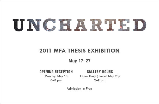
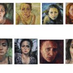
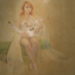
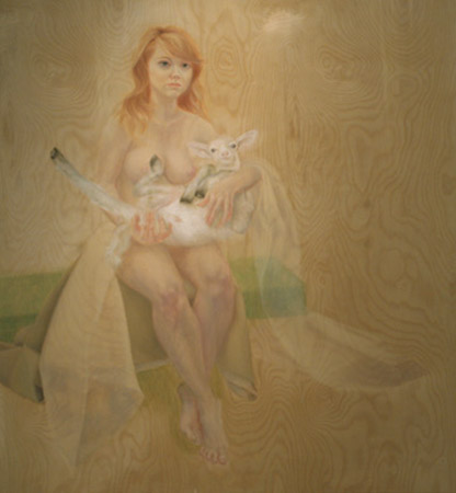
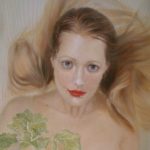
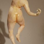
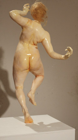
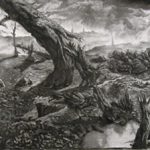
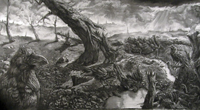
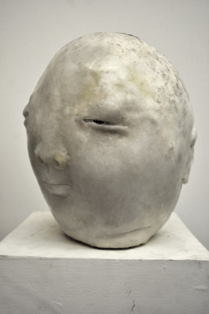
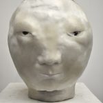
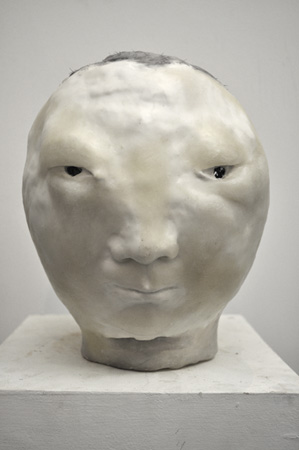
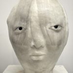
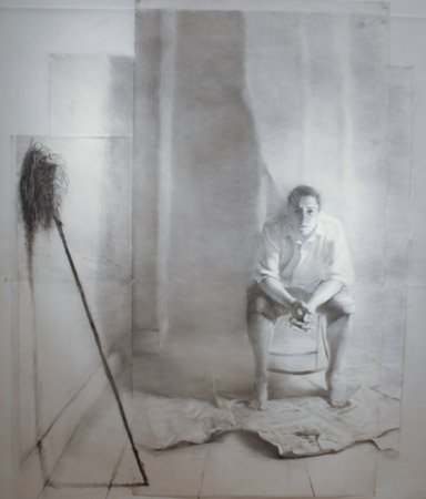
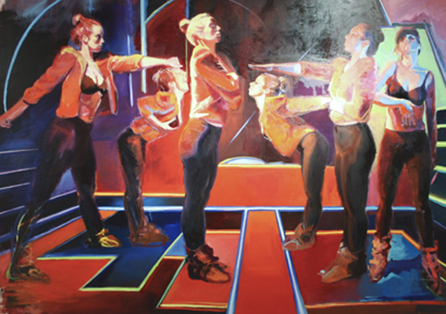
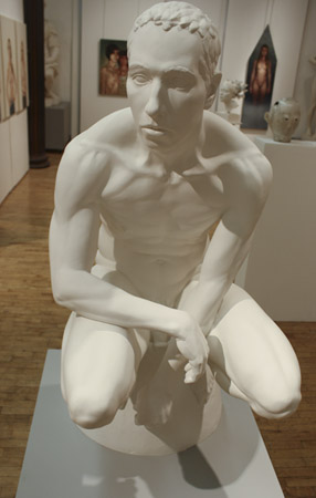
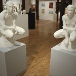
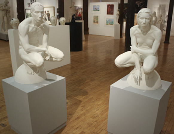
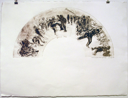
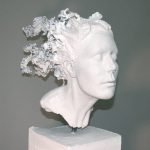
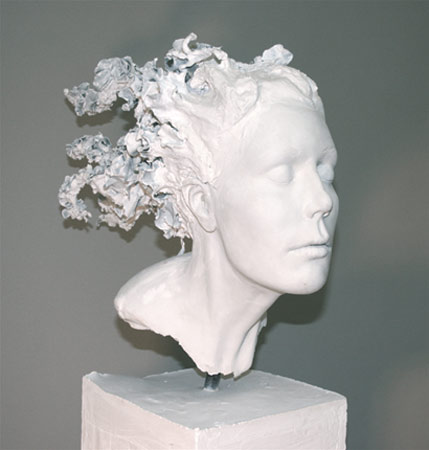
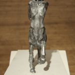
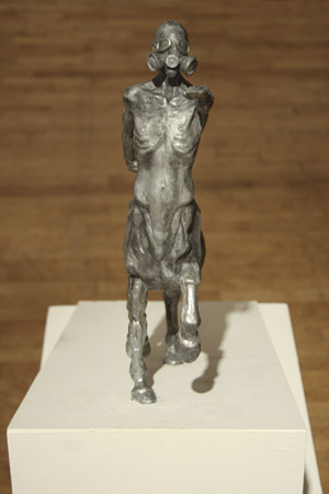
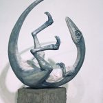
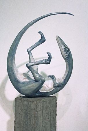
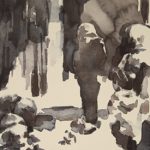
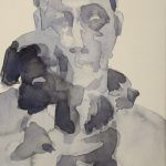
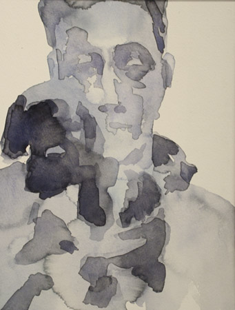
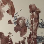
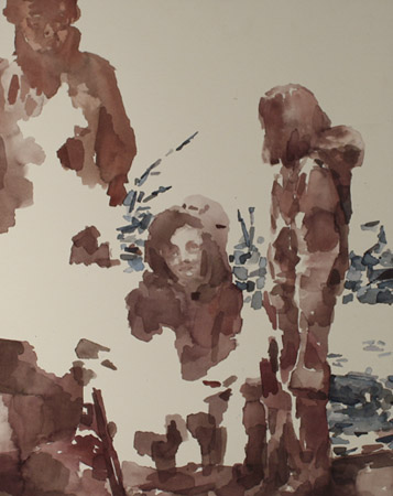
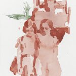
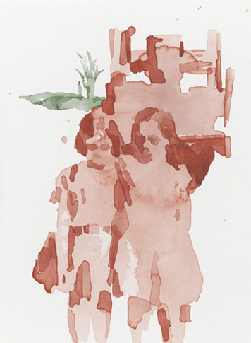
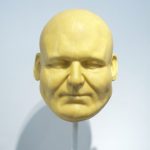
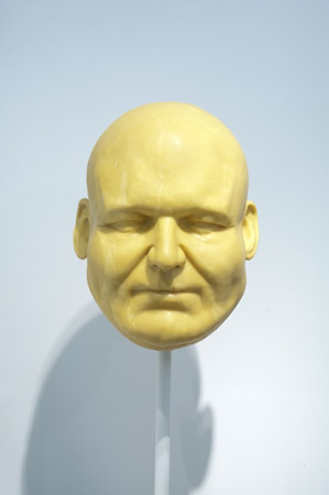
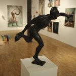
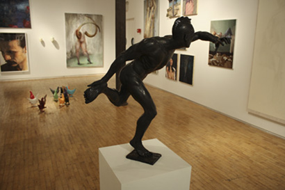
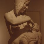
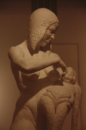
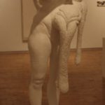
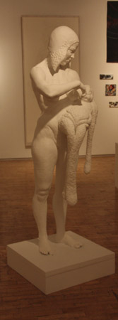
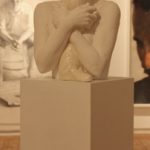
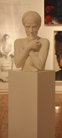
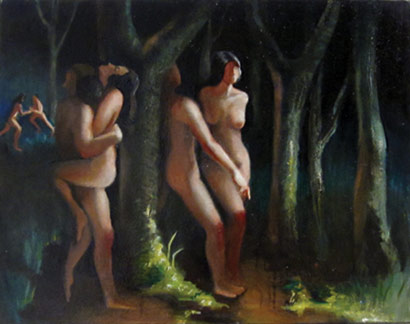
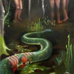
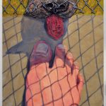
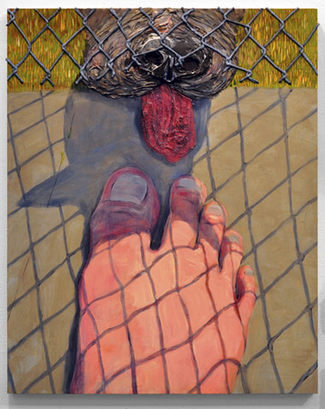
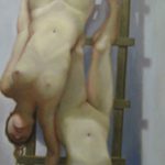
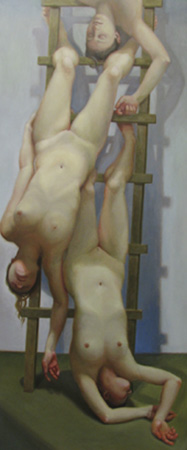
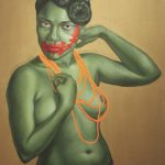
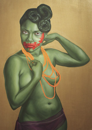
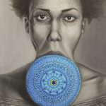
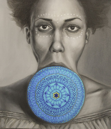
UNCHARTED: the 2011 MFA Thesis Exhibition

The New York Academy of Art is pleased to present UNCHARTED, a group exhibition featuring original paintings, drawings, sculpture and prints by sixty talented emerging artists.
Immersed for two years in an intensive learning environment that combines rigorous skills and conceptual training, these MFA candidates are using a time-honored artistic language from which they are creating innumerable distinct dialects. The 2011 graduates of the New York Academy of Art reveal that they are sixty individuals striding sure-footed onto an entirely contemporary landscape.
A catalog will be available, featuring an essay by renowned art critic and Academy Senior Critic Donald Kuspit. The title for the exhibition was suggested by MFA candidate Emily Adams. (Emily is also a guest-writer on this blog! Use the SEARCH bar, left, to see her other posts about her thesis artwork. RSVP to our event on the Academy’s page on facebook.)
The exhibition is free and open daily from Noon – 7pm, (closed May 20)
May 17 – May 27, 2011
Opening: Monday, May 16, 6 – 8 PM
http://www.nyaa.edu/
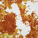
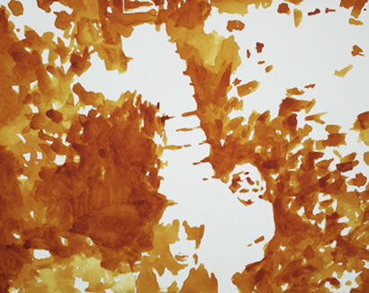
Ken Johnson, Visiting Critic
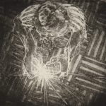
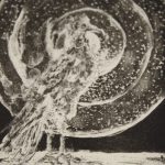
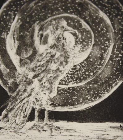
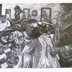
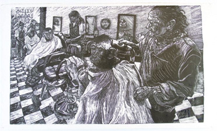
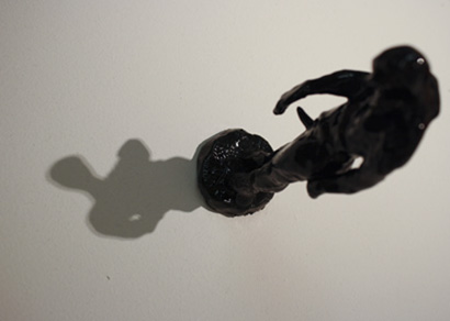
Current student Aliene de Souza Howell (2011) shares her thoughts on a recent critic’s visit to the Academy. The Academy’s Career Development Workshop lunchtime lecture series, created through Elvin Freytes, Sharon Louden and Peter Drake, brings writers, critics, gallerists, alumni, artists and teachers to speak with students and alumni about various aspects of career development.
On the threshold of his new book, Are You Experienced?, New York Times Art Critic Ken Johnson recently delivered a Career Development Workshop and critiques at the Academy. I was impressed with the often autobiographical lecture he wrought with personal reflections questioning himself as a captive of capitalism, about pressure from directors and the “schadenfreude” of the New York art scene among artists and critics alike.
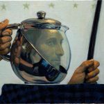
 |
| Johnson’s book – Are You Experienced? |
He spoke of the complete intersection of art and money that throttles the New York City art scene. This led him, a former Jungian Marxist, to turn inwardly and ask questions regarding the nature of his role as a critic. But with an MFA from SUNY Albany and a BA from Brown, Johnson knew the need for a voice from the perspective of a trained artist amidst the advent of theorists that had cropped up in the 80’s. He articulated with candor on the tug-o-war of desire to stand strong as an independent and for recognition as a competitive player among the biggest voices.
When reflecting on art that moved him, he perhaps tugged most at the hearts of the Academy audience. Johnson spoke of authenticity and wanting to see the self-discovery of the artist and the tangible qualities of the hand made. As a reviewer, he said he believed in a complete act of art criticism that addressed history, sensory qualities and the concept behind the piece. Speaking like an artist on creating, Johnson said that when he’s writing he “loves that thing that happens when feelings turns into words, true to how I actually experienced something.â€
Fleshing out ideas on concept, he brought up the dialectal nature between the metaphoric and the metonymic in art. In their extremes, they are irrelevant with the metaphoric losing touch with reality and the metonymic becoming didactic and obvious. Both still need each other to exist, though. His artistic preferences leaned toward the metaphoric. This may be the subject of his next book, “Ground Control to Major Tom”.
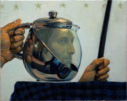
 |
| Newest print! 36″ square on mulberry paper. |
Professionally, he offered this: do NOT cold call critics, for better or for worse the “consensual reality†between the galleries/museums and critics still holds true and is the established venue for picking artists to review. He pointed out that because studio visits and the selecting artists to show are the job of the gallerist, reviews tend to be directed not only at the artist but also to the institution who selected them.
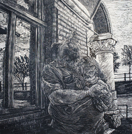
From his critique of my work in my studio, I was inspired by our conversation on archetypes, symbology and the uncanny. He insightfully suggested pushing aspects of the subject matter in my linocuts.
And don’t forget to check out Ken Johnson’s recommended reading: Jacques Derrida’s Of Grammatology, and his most recent reviews on Joan Semmel, Julia Jaquette, and Anthony Caro.
Why I Love Deadlines
The New York Academy of Art is pleased to share a note by Hilary Harkness. Regularly posting her “Notes from Studio Lockdown,” Hilary blogs with us as she prepares for her upcoming exhibition at Mary Boone Gallery in New York City, on Thursday, May 5, 5–7pm.
Dear friends,
As I prepare for my May 5th show (please come! the opening is 5-7pm at the Mary Boone Gallery in midtown, at 745 Fifth Ave.), I find that everything non-essential has dropped from my life. I have always built my life around convenience, trying to live within feet of subway stops. For years I lived within three blocks of the 1,2,3,L, F,M,A,C,E,B & D so I could waste less time. I work at home as close to the kitchen as possible to save on footsteps. I don’t care about clothes as long as I look ok, and will buy a generic wardrobe for a season in an hour at one store. I tell hairdressers to just make me look normal. My life has been designed to eliminate distraction.
I am currently finishing a painting of the last night of the Yamato, a Japanese battleship that went on a suicide mission in 1945. The painting began in my head five years ago while listening to a Dolly Parton song of all things. I researched exact battleship plans and drew out the interior on a thin piece of paper. You can see a hundred feet deep into the ship, and I have all the rooms to scale, receding into space. In this painting I wanted to speculate about the different things people might do when faced with certain doom. I knew where to dig for historical details, and how to make the painting make sense. I built a filing system to deal with my thousands of pieces of information. I looked over my past successes and failures at painting to pick approaches to materials that work. I covered the ferrules of my brushes with tape so reflected light wouldn’t disrupt my vision. I made mini-palettes out of plastic lids and taped them to my painting and taped folded bounty paper towel to myself to wipe my brushes on so I wouldn’t distract myself with movement. My goal was to be smart about the process so all my efforts would directly make the painting more pleasurable for the viewer.

 |
| taping brushes to reduce glare |
 
The truth is, the past year and a half of work on this painting has been a disaster, as always. I drew the plans small, then changed the shape of panel so I had to tape extra pieces of paper to the drawing. There were so many perspective guidelines, I couldn’t see what I was doing and had to color things in with markers to visualize the space.

| muse as avatar |
I redrew it on a clean piece of paper to the size of my new panel, then wadded up the drawing and carried it around town in my handbag while fretting about conflicting themes. Want to annoy your friends – pull out a 42†drawing at dinner! Want to annoy your non-artist girlfriend – insist she tries painting so she can see how hard it is (she made it look easy)! I have maybe a hundred ideas for sea creatures to add to the flooding bowels of the ship, but the deadline is in a week so my subconscious will have to pick the best five. Despite my best attempts to stick to the appointed story line, my real themes about domesticity have dominated, completely subverting or even sabotaging the painting from within.


| cat as avatar, atop the sketch |
 
I was smart about how I started the painting, streamlining my life and methods. But with a week to go until the art shipper arrives, I’m finding out what’s important: whatever comes out. 90% of my effort has been with playing with things and pushing things around and now I can only trust in the process, that my subconscious has been primed and I can make something effortlessly. It’s as though I’ve practiced making the painting, so when I paint it, I already know what I’m doing and it feels effortless – but not really in my control.
So what do I love about deadlines? My friends who believe in me and send their love and support to me as I sit diligently watching my painting unfold. I don’t even have to explain to them how I feel because we all go through this. I can’t be the artist I would like to be, but maybe this experience is what I signed up for when I devoted my life to painting.
Yours very truly,
Hilary Harkness
PERSISTENCE OF VISION / THE PETERSON COLLECTION
The first ever public exhibition of The Peterson Collection of Contemporary Realist Art, Persistence of Vision includes work acquired internationally by Gregory J. Peterson since he began collecting more than twenty years ago. The approximately 75 works on view will focus on realistic representational styles. Born in Harlem, Mr. Peterson has written about Contemporary Realism and has spoken on art collecting in museums and private venues in the US and Europe. Selected works from this exhibition are in the collection of the Metropolitan Museum of Art.
Cornscapes
 |
| Ode to Nebraska, oil on canvas, 48x60in. |
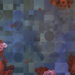
by Emily Adams (MFA 2011)
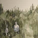
It’s the end of the semester and we’re seeing our MFA Thesis projects through to completion. To close up the posts on my thesis process throughout second year here at the Academy, I thought I’d share several of my most recent paintings, along with some interesting work that has been brought to my attention over the course of the past couple months. Exploring American farmland, aerial view, has been like picking up a rock to discover a whole other world underneath. With one of the simplest of subjects—the grid—I’ve found all kinds of problems to try to solve over the months. A straight grid speaks to an entirely different history of painting than one shifted into perspective, color and atmosphere follow different sets of rules when investigated from 30,000 feet in the air, and the surface of the painting itself has become a more significant subject when the image is so pared down. Most importantly to me, the grid as farmland, too, lends additional elements of narrative and symbolic suggestion that only representational painting can bring. Who would have thought soybeans and corn could offer so many aesthetic possibilities?
 |
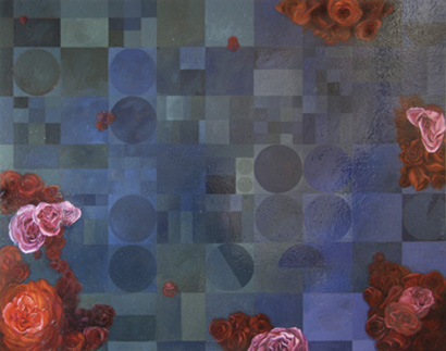
| Crops (Night Raid), oil and alkyd on panel, 18x36in. |

 |
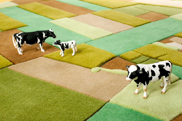
| Carpet design by Florian Pucher |
In the past couple of months, friends have sent along various sightings of crops popping up in several corners of art and design worlds. I wasn’t really looking to be in dialogue with a carpet designer, but this just confirms my suspicion that the grid is slowly making its way into our visual culture as a new, dominating form of landscape.
Also, if anyone can help me, I am still trying to track down the artist who made this piece spotted hanging at a gallery on 23rd St.
 |
| William Steiger’s Aerial Survey #2 at Margaret Thatcher Projects [Identified- Thanks to John Jacobsmeyer] |
As I look forward to developing my own work after graduation, I’ll be thinking a lot more about the concept of ‘cultivation’ particularly in the context of the early American botanical and cultural history that I am related to. Culture, the word itself, has its Latin roots in tilling and agriculture, so exploring the ‘cultivation’ of a society in a new landscape by juxtaposing variations in the traditions of landscape and flower painting (considering flowers moved with people across seas to be hybridized and seeded in so-called ‘virgin’ soil) seems to me a good place to dig for now. Here are a couple of interesting grandparents of the melded genres:
 |
| Giovanni DiPaolo, St. John the Baptist Goes Into the Wilderness, tempera on poplar, 1454 |
 |
| Jacques Le Moyne De Morgues, Young Daughter of the Picts, circa 1585 |
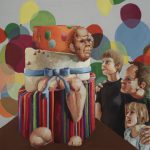
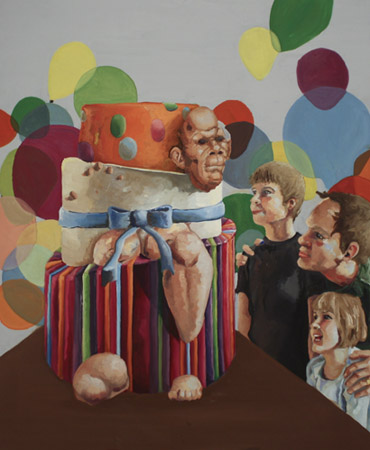
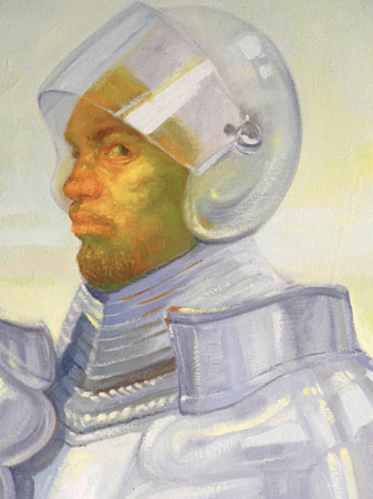
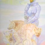
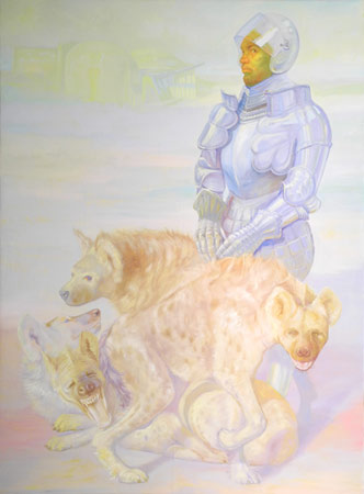
Eric Telfort: Keeping the Brushes Wet, part 3
The New York Academy of Art is pleased to present the next installment in this new series on our blog. Eric Telfort, a 2009 graduate of the New York Academy of Art, blogs with us about “keeping the brushes wet.†Eric will be speaking at the Academy as part of the Career Development Workshops on April 21, 1-2pm. Current Students and Alumni welcome to attend! Follow us as Eric writes about what it’s like to be a working artist.
Continued from the last post:
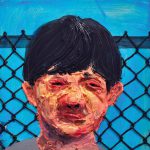
As an AmeriCorps supervisor, I tend to the children of a small community in Providence, RI. I eat trail mix and delicately prepared buffalo chicken sandwiches for lunch. I arrive home at 6:30pm and am tranquilized by the msg dinner that I often prepare. I wake up at 3am and the system starts all over again. As grim as this may sound there is hope. I am coming to grips in understanding that art is the liquid that makes my heart pump. As much as I love the kids I work with, not being able to paint makes me feel nothing. Wine has no taste without the art to accompany it. I have made serious sacrifices in the last month to win the custody battle of my art from my other life; the one that pays my bills. Gone are facebook, and the romances of 2010. They shall be missed, especially the ladies. My only romance at this point is the brush and the canvas, and on occasion the sculptor’s clay and Breyers vanilla ice cream. I am working on continuing the series I began during my 2nd year at the Academy. I like to make paintings reinterpreting my artistic childhood as an adult. What I find many times is so much of society’s issues were present in my own childhood and now reside in my paintings. I was too naïve then to pay attention to them and rightfully so. I was 6, and being 6 is not easy when you have a backyard full of junk to battle invisible aliens with. Even as an adult, I am not able to see these common threads until the piece is near completion. It is now 6:30am and the shower calls. For the first time, the thoughts that go through my mind between 3am now have found their way onto digital format – this blog. Either way, going forward the message I hear in my mind every morning is “the brushes can not dry.†Time for work.
To be continued…

Tribeca Film Festival at the Academy